Discover how market psychology and data compression shift across different timeframes — and why support and resistance levels don’t vanish, they evolv.
Understanding Timeframe-Dependent Support and Resistance
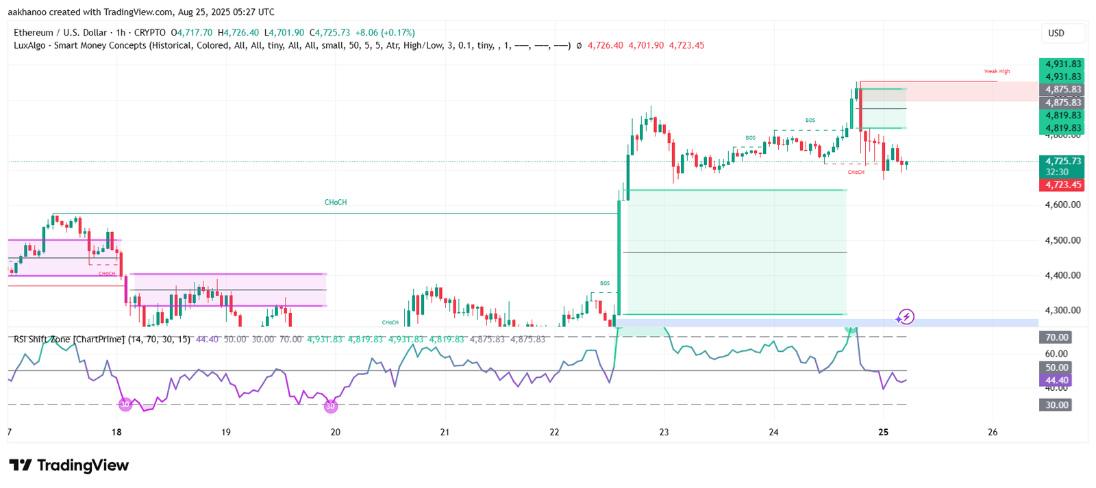
What you’re observing touches on one of the most foundational—and frequently misinterpreted—principles in technical analysis: support and resistance levels are inherently tied to the timeframe you’re analyzing.
These levels don’t vanish or become irrelevant as you shift from a 5-minute chart to a daily or weekly view. Instead, what changes is the context:
- ⏱️ Data compression alters how price action is visualized. Shorter timeframes reveal micro-movements and noise, while longer timeframes smooth out volatility and highlight broader trends.
- 🧠 Market psychology evolves with scale. A resistance level on a 1-hour chart might reflect short-term trader sentiment, whereas a weekly resistance level often represents institutional positioning or long-term investor behavior.
Support and resistance are not fixed coordinates—they’re fluid zones of interest, shaped by the collective behavior of market participants within each timeframe. Recognizing this dynamic helps traders avoid false signals and better align their strategies with the dominant market narrative.
The Logic Behind Timeframe Shifts
Data Compression: Why Candle Size Alters Perception
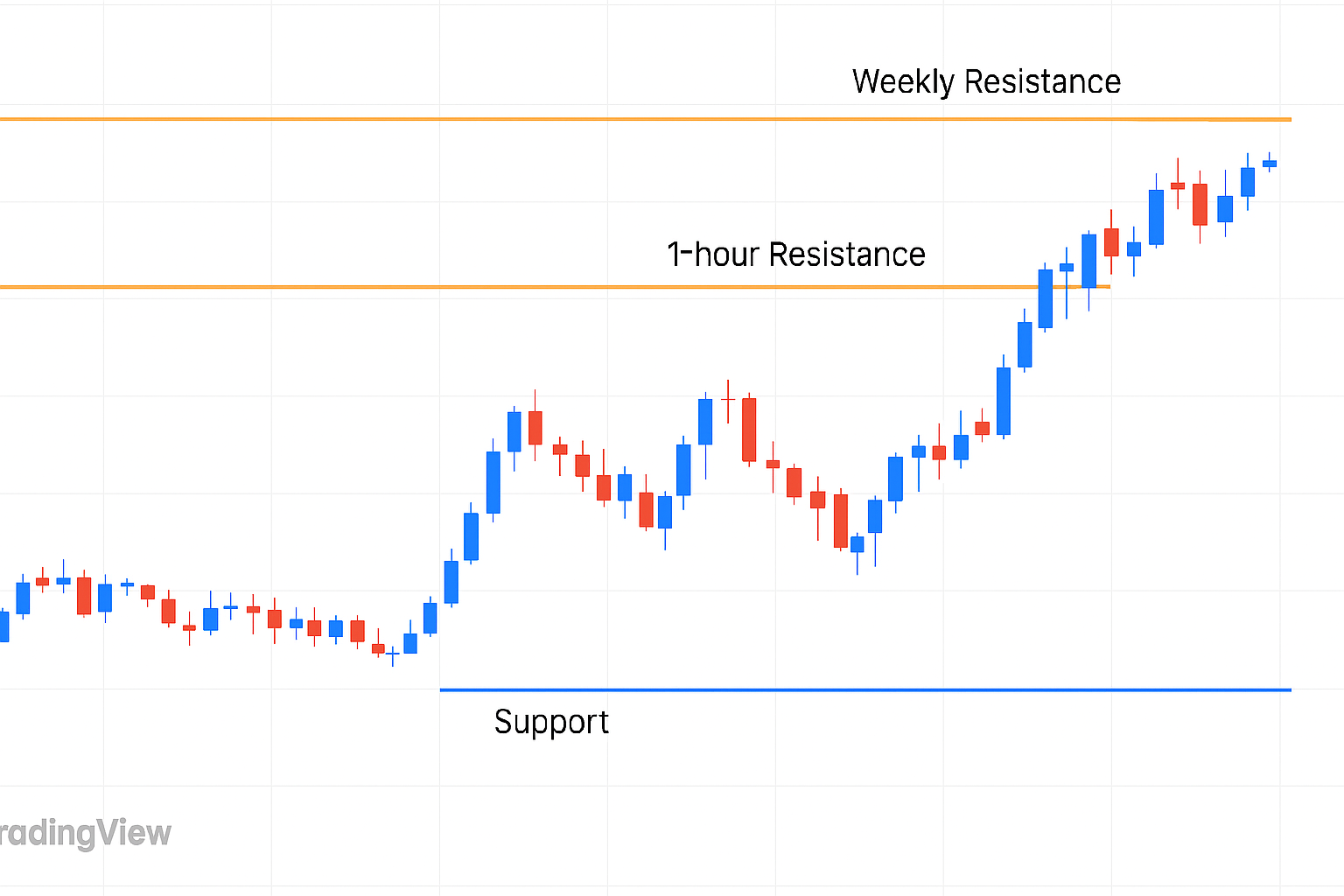
When analyzing price action, the timeframe you choose has a dramatic influence on what you see—and what you miss.
- 📈 On a 1-hour chart, each candle encapsulates just one hour of market activity. This granularity exposes every minor swing, wick, and micro-reaction. Traders can spot short-term support/resistance zones, scalp-level reversals, and intrabar volatility with precision.
- ⏳ On a 2-hour or 4-hour chart, those same movements are compressed into fewer, broader candles. The result?
- Small fluctuations that seemed significant on the 1H chart—like a double top or a failed breakout—may now be absorbed into a single candle body.
- Minor highs and lows can vanish from view, buried inside the larger structure of multi-hour candles.
This phenomenon is known as data compression. It smooths out market “noise,” making broader trends easier to identify—but it also conceals short-term levels that active traders rely on.
Why It Matters:
Understanding data compression helps traders avoid misinterpreting price action across timeframes. A resistance level that looks decisive on the 1H might not even register on the 4H. Conversely, a clean breakout on the 4H could appear messy or premature on the 1H
Market Participant Layers: Who’s Driving the Levels?
Support and resistance aren’t just technical constructs—they’re reflections of who’s trading and how they think. Each timeframe corresponds to a different layer of market participants, each with distinct goals, risk tolerance, and reaction speed.
⚡ Scalpers & Intraday Traders (1H and below)
- These traders operate on speed and precision.
- They react to short-term price movements, news spikes, and micro-structure shifts.
- Their actions generate temporary support/resistance zones that may only hold for minutes or hours.
- Think of them as the “first responders” to price volatility.
🧭 Swing Traders & Position Traders (4H, Daily, Weekly)
- These traders zoom out to spot broader trends and macro setups.
- They largely ignore intraday noise, focusing instead on clean breakouts, trend reversals, and multi-day consolidation zones.
- Their decisions shape longer-term support/resistance, often respected across multiple sessions.
🔄 Timeframe Switching = Psychology Switching
When you change your chart from 1H to Daily, you’re not just compressing data—you’re shifting your lens to a different mindset.
- On the 1H, you’re watching the fast-paced psychology of short-term traders.
- On the Daily, you’re tapping into the strategic thinking of swing traders and institutions.
Understanding this layered structure helps you anticipate which levels are likely to hold, which ones are fragile, and how different trader groups might react to the same price zone.
Fractal Nature of Price: Repetition with Relevance
Markets are inherently fractal—meaning price patterns, structures, and behaviors repeat across all timeframes. You’ll see double tops, flags, breakouts, and consolidations on the 1-minute chart just as you would on the weekly. But here’s the nuance: not all levels carry equal weight.
🧩 Same Patterns, Different Impact
- A resistance level on the 1-hour chart might look decisive to an intraday trader.
- But for someone trading off the daily or weekly chart, that same level could be irrelevant—just a minor bump in the road.
- If the higher timeframe trend is strong (e.g., a bullish breakout on the daily), price may slice through 1H resistance without hesitation, leaving short-term traders confused or trapped.
📐 Why This Matters
- Fractals explain repetition, but hierarchy explains dominance.
- Higher timeframe levels tend to override lower ones because they reflect broader market consensus and institutional positioning.
- Lower timeframe levels are more reactive, often driven by short-term sentiment, news, or scalping behavior.
Strategic Takeaway When mapping support and resistance, always consider the fractal structure but prioritize the dominant timeframe for your strategy. If you’re swing trading, don’t get baited by 1H noise. If you’re scalping, be aware of looming daily levels that could reverse your setup.
Significance Hierarchy: Why Higher Timeframes Rule the Map
Not all support and resistance levels are created equal. Their strength and reliability often depend on the timeframe in which they’re formed—and that’s where the concept of significance hierarchy comes into play.
Higher Timeframe Levels (Daily, Weekly, Monthly)
These levels act like structural beams in the market architecture. They’re stronger, more respected, and harder to break for several key reasons:
👀 Visibility Across the Board More traders—from retail to institutional—monitor higher timeframe charts. A resistance level on the weekly chart is seen by swing traders, hedge funds, and long-term investors alike. This collective awareness reinforces its psychological weight.
💰 Volume-Backed Conviction Price action on higher timeframes typically involves larger volume and deeper commitment. When a level forms over days or weeks, it reflects sustained buying or selling pressure—not just fleeting reactions.
🧱 Structural Importance These levels often align with macroeconomic events, earnings cycles, or long-term trend shifts. Breaking through a weekly resistance isn’t just a technical move—it can signal a fundamental change in market sentiment.
Lower Timeframe Levels (1H and below)
While useful for scalping and intraday setups, these levels are more fragile:
- They’re shaped by short-term sentiment, news spikes, and micro-reactions.
- They’re easier to break, especially when higher timeframe momentum contradicts them.
- They often serve as temporary pivots rather than long-term anchors.
When planning entries, exits, or stop placements, always consider the hierarchy of significance. A 1H support might offer a bounce—but if it’s sitting beneath a strong daily downtrend, it’s likely to fold. Conversely, a weekly support zone can act as a magnet for price, even if short-term charts look bearish.
Why This Confuses Traders: The Myth of Universal Levels
One of the most common pitfalls for new traders is the expectation that support and resistance levels are universal—that a price zone marked on one chart should hold true across all timeframes. It’s an intuitive assumption, but it’s also misleading.
🗺️ Each Timeframe Has Its Own Map
A 1-hour chart might show a clean resistance at 1.2450, respected multiple times intraday. But on the daily chart, that same level could be buried inside a broader consolidation zone or trend continuation. The result? What looks like a reversal on the 1H may be nothing more than a pause in a larger move on the Daily.
These “maps” are built by different groups of traders, reacting to different signals, with different goals. And while they overlap, they don’t always align.
⚠️ Conflicting Signals = Confused Decisions
If you’re trading off the 1H chart but your stop is placed based on a Daily level, you might get whipsawed.
If you ignore the Weekly trend while scalping, you could be trading against institutional momentum.
Without knowing which timeframe logic you’re operating under, your strategy becomes reactive instead of intentional.
Before placing a trade, ask yourself: Which map am I using?
Are you navigating short-term volatility or long-term structure?
Are your levels respected by scalpers or swing traders?
Is your setup aligned with the dominant timeframe trend?
Clarity on this front transforms confusion into confidence.
What You Might Be Missing: How Professionals Stay Aligned Across Timeframes
Many traders struggle with conflicting signals, whipsaws, and false breakouts—not because their technical skills are lacking, but because they’re reading the market through the wrong lens. Professionals avoid this trap by following a structured, multi-timeframe approach that filters noise and aligns execution with broader market logic. Here’s how they do it:
Top-Down Analysis: Building the Trade from the Macro Down
Professional traders begin with the highest timeframes—Weekly, Daily, and 4H—not because they’re slow, but because these charts reveal the structural backbone of the market. These timeframes expose long-term support and resistance zones, trend direction, and institutional footprints. By starting here, traders identify the zones where price is most likely to react meaningfully.
Once these major levels are marked, they drop into lower timeframes like the 1H or 15-minute charts. These granular views aren’t used to redefine the trade idea—they’re used to refine it. Lower timeframes help pinpoint precise entry triggers, stop placements, and short-term momentum shifts. This top-down process ensures that every trade is rooted in broader context, not just short-term noise.
Level Filtering: Aligning Micro Moves with Macro Zones
Pros don’t treat every support or resistance level as tradable. They apply a strict filter: does this lower timeframe level align with a higher timeframe zone? If not, it’s discarded.
For example, a 15-minute support might look promising—but if it sits in the middle of a strong daily downtrend, it’s likely to fail. Conversely, if that same 15-minute support aligns with a weekly demand zone, it becomes a high-probability bounce area. This filtering process helps traders avoid setups that are technically valid but contextually weak. It’s not just about finding levels—it’s about finding levels that matter.
Context Awareness: Reading the Market’s Intent, Not Just Its Shape
One of the most overlooked skills in trading is understanding context. A resistance level on the 1H chart might look clean and well-tested, but if price is moving within a strong daily uptrend, that resistance is more likely to break than hold. Why? Because the dominant market narrative favors continuation, not reversal.
Professionals constantly ask: Is this level fighting the broader trend, or flowing with it? They don’t just trade patterns—they trade patterns within context. This awareness helps them avoid countertrend traps and align their trades with the prevailing momentum.
Together, these principles form a cohesive framework: start with the big picture, refine with precision, filter with discipline, and execute with context. If you’re architecting this into a dashboard or plugin, we could visualize it as a multi-layered trade map—where each level is tagged by timeframe, relevance, and directional bias. Want to sketch that logic next?